


Most warehouses today are heavily automated. RF scanners drive task execution, RFID tracks handling and transportation units, and Material Flow Systems orchestrate PLC-driven robotic movement. The data is all being captured.
What is often missing is anywhere to see it. Task statuses sit in RF logs, checkpoint pings sit in RFID, and conveyor health sits in MFS queues — three systems that rarely meet on one screen. So supervisors still walk the floor to find out where the backlog is, and performance conversations still centre on how fast individual pickers are moving rather than whether the system itself is flowing.
The SAP EWM Easy Graphics Framework (EGF) closes that gap from inside EWM. This post covers what EGF does, how the Warehouse Cockpit and its measurement services work, when to build a reusable service versus a simple query, a worked picking-optimization example, and where SAP is taking data visualization next.
Modern warehouses use various automation layers to drive execution.
Despite these advanced technologies, a critical visibility gap remains at the shop floor level. Operations still rely heavily on person-specific KPIs rather than real-time, system-driven insights.
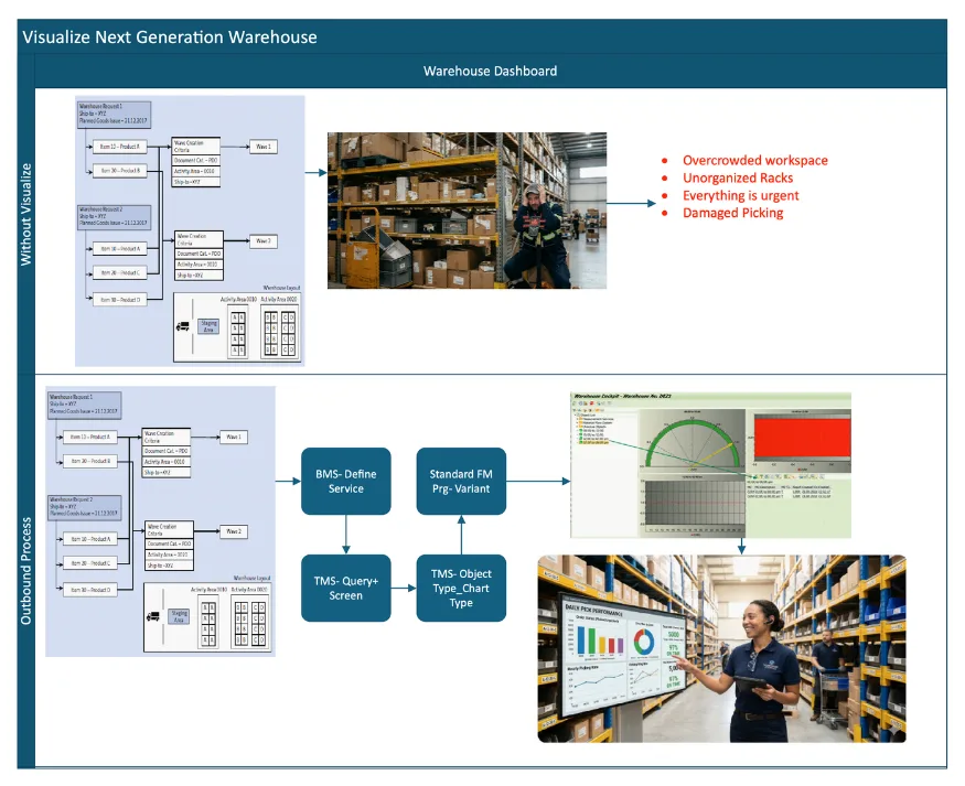
Current warehouse ecosystems capture massive amounts of data but lack centralized visualization
Siloed Data: Information sits scattered across RF logs, RFID checkpoints, and MFS queues.
Delayed Decisions: Managers lack a single, auto-refreshing dashboard for immediate shop floor action.
Blind Spots: Supervisors cannot instantly see bottlenecks in automated zones vs. manual picking areas.
The whitepaper introduces a Centralised Shop Floor Visibility Dashboard integrated with SAP EWM.
Implementing this centralized visibility layer transforms daily warehouse operations.
Warehouse solutions demand real-time visibility, flexible user interfaces, and centralized control. The deployment of the Easy Graphics Framework (EGF) within EWM (embedded or decentralised) directly addresses these needs. This design relies on three core features to keep things running fast. This design relies on three core features to keep things running fast
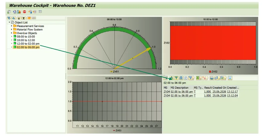
The SAP EWM Warehouse Cockpit is a real-world example of this framework in action. Launched with transaction code /SCWM/EGF, it acts as your main command center by turning complex warehouse data and AI predictions into simple, interactive charts.
This single visual dashboard lets operations teams track key performance indicators (KPIs) in real time using four main tools:
Standard cockpits give you a great baseline, but what if you need specialized metrics? EGF lets you create custom data points through SAP EWM measurement services. You can then plug these proprietary metrics straight into your main warehouse cockpit menu.
Adding custom metrics to your dashboard involves a simple two-step process:
Let’s look at a real-world example: tracking operational backlogs. To see how much work is piling up, you can set up a tool that counts open Warehouse Orders in a specific area for queue determination to plant intelligently or Wave’s scheduled to be released for Automatic Warehouse Task creation to deliver information “What matters most to them”.
You can easily build this custom tracking tool by opening the Tailored Measurement Service Wizard through transaction code /SCWM/TLR_WIZARD.
The system pulls and calculates your metrics using three distinct tiers. You can find the configuration under
SPRO_IMG_ SCM Extended Warehouse Management_ Extended Warehouse Management_ Monitoring_ Measurement Services
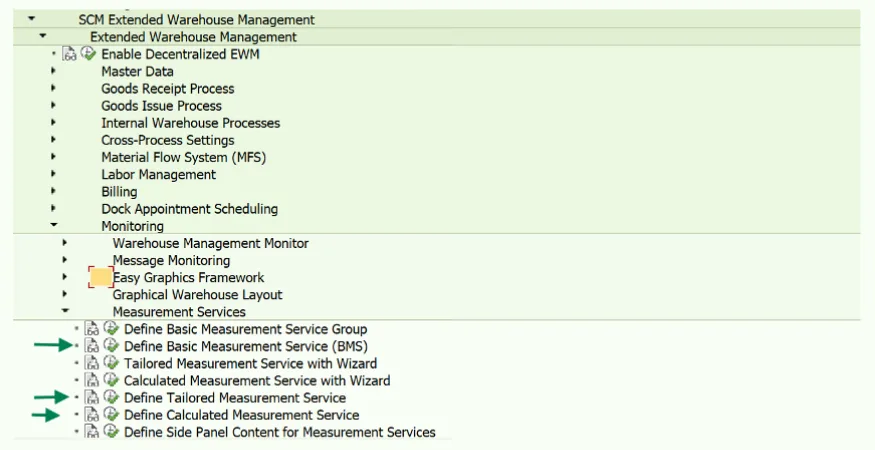
These are standard, pre-built tools from SAP that track everyday warehouse tasks, like counting order lines or open tasks. Every BMS connects a specific name to two behind-the-scenes modules:
Use the built-in wizard to customize standard tools for specific operational needs.
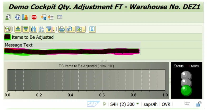
Use Case for Threshold- Open Warehouse Order Backlog.
Your team is monitoring the total number of open orders in the Picking Zone. You set your performance thresholds based on how many unassigned orders the system detects:
🟩 Green (Normal Operations): 0 to 50 open orders- The current staff can handle the volume easily.
🟨 Yellow (Warning Zone): 51 to 100 open orders. Work is piling up. The supervisor receives a dashboard alert to monitor the zone.
🟥 Red (Critical Bottleneck): 101+ open orders. A severe bottleneck is occurring. The system triggers a bright red alert on the warehouse cockpit dashboard so managers can reallocate workers immediately.
Use a secondary wizard to mix different tailored metrics using math equations. This allows you to track complex efficiency ratios.
EGF is the presentation layer that turns data points into interactive graphics called EGF objects. Your warehouse cockpit is simply a dashboard built out of these objects.
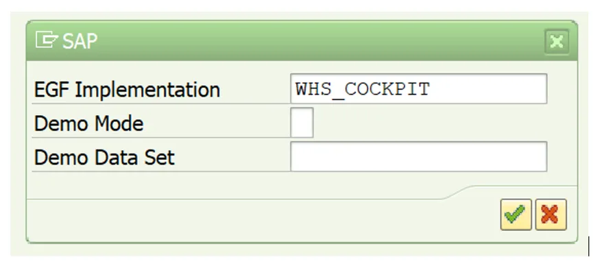
How It Runs: When you open a cockpit (such as WHS_COCKPIT), a background code layer handles the complex processing to render your graphics flawlessly.
When a user opens a cockpit dashboard, the system follows a clean, three-step process in the background to build and display your charts:
Deciding whether to build a full Basic Measurement Service (BMS) or stick with a basic database selection depends on your long-term goals. Use this simple framework to make the right choice:
The Logistics Challenge: Shipping Before 11:00 AM
When your warehouse faces a hard 11:00 AM shipping deadline, picking items from scattered locations causes major congestion and slows down your routes.
You can fix this by fine-tuning your BMS selection parameters. Setting up your filters to track early wave cutoffs and specific picking locations lets you proactively manage these bottlenecks on your dashboard.
Assumption: Standard SAP EWM wave management is already up and running; our focus here is strictly on the EGF side.
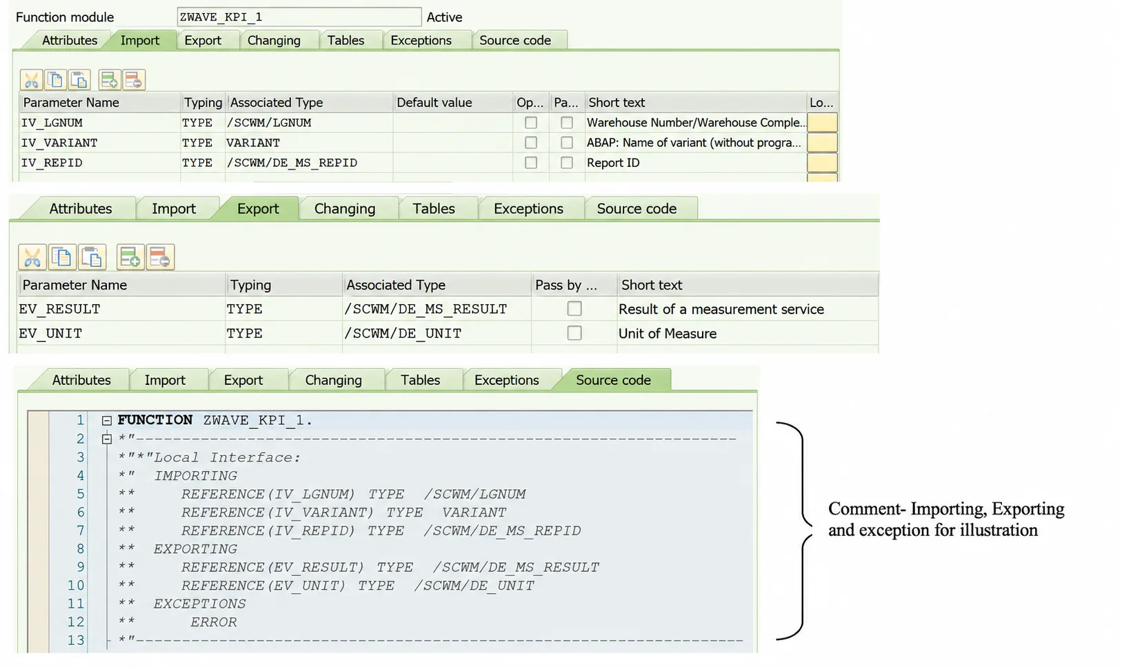
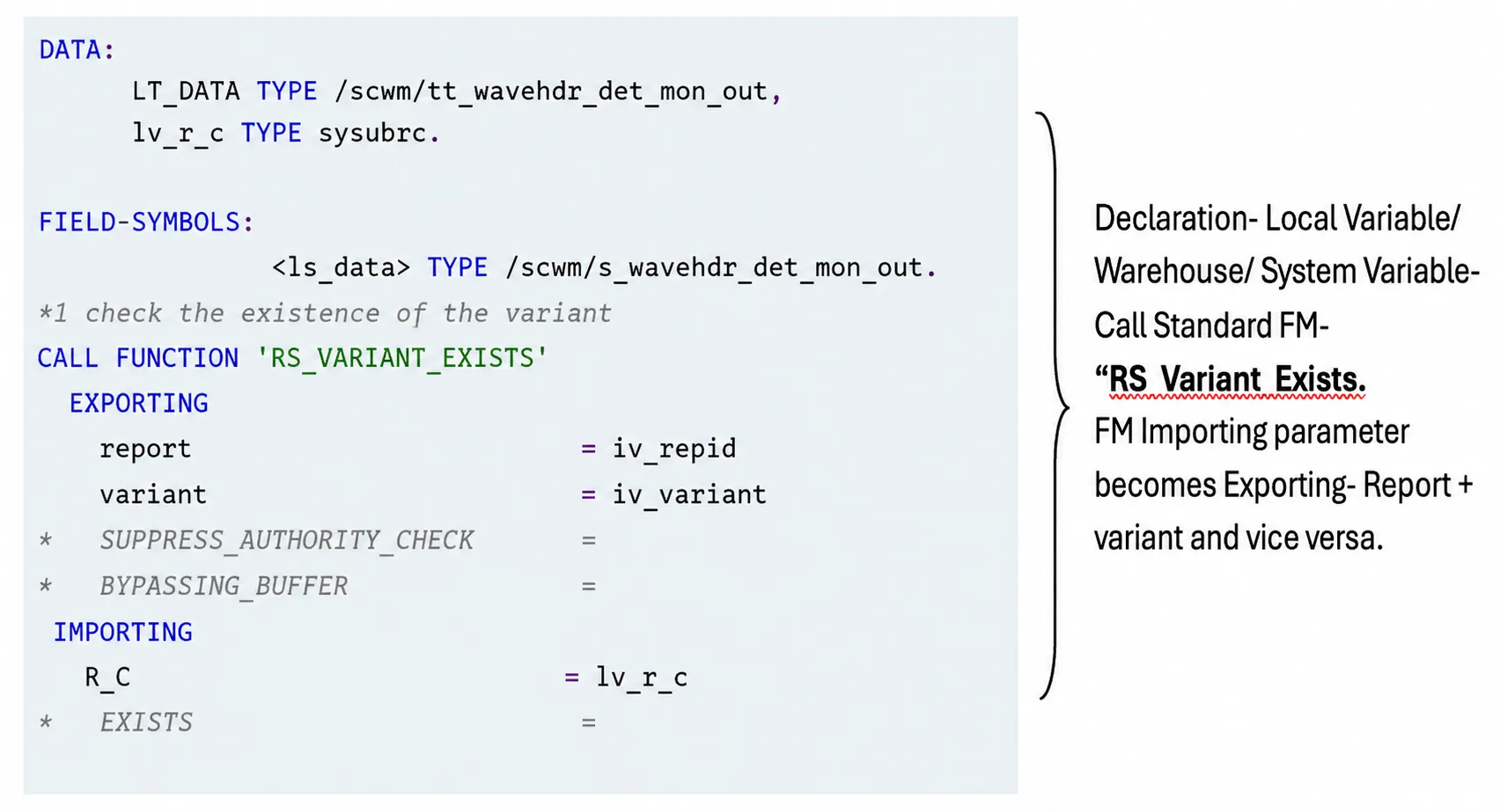
Function module for the value determination within the new function group - Se37- ZBKS_WAVE_KPI
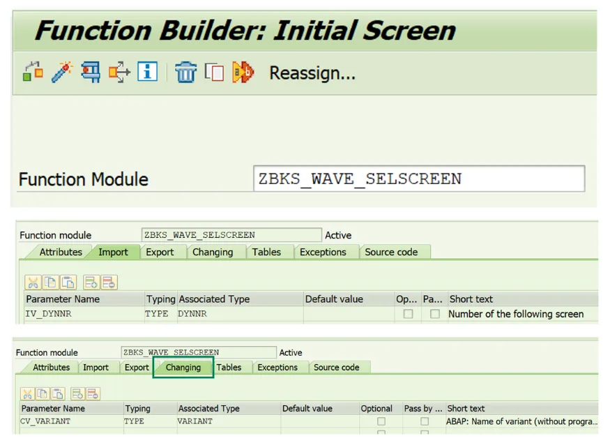
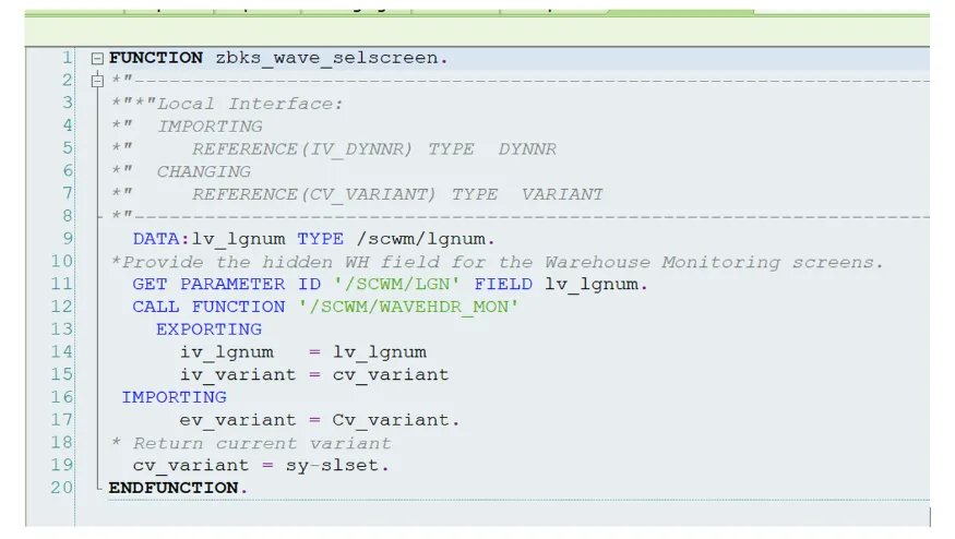
Define screen and pass varaint as changing parameter in FM.
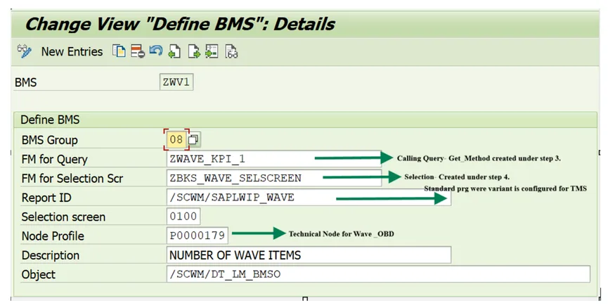
Funtional Mapping- BMS Group we used under “08- Miscellaneous”.
Dispay Warehouse Cockpit- /N/SCWM/EGF
As warehouse technology evolves, SAP’s approach to data visualization is shifting away from legacy systems toward modern, cloud-based tools. Here is where the roadmap is heading:
For custom data visualization, interactive charting, and business intelligence, SAP points customers toward:
The roadmap and the recommendation in this post are not in conflict — they answer different questions.
SAC and Fiori/UI5 are where enterprise analytics is heading: cross-functional reporting, planning, and business intelligence that spans the organization. That is the right place to invest for corporate visualization.
EGF answers a narrower and more immediate question: how does a supervisor see, on a screen above the picking zone, that the backlog has crossed 100 open orders and workers need reallocating now. It runs inside EWM, against live warehouse data, with no additional platform or integration layer. For operational shop floor visibility, it remains the practical choice today.
The gap worth closing first is the one between the automation you have already paid for and the visibility your supervisors actually get. A cockpit built on measurement services and EGF objects closes it with configuration and a modest amount of custom development — not a new platform.
ArchLynk implements and optimizes SAP EWM for warehouse and logistics operations worldwide. If you are working through shop floor visibility, cockpit design, or a broader EWM rollout, our team can help.